Member-only story
How to Make Responsive Steps Progress Bar with Vanilla JavaScript
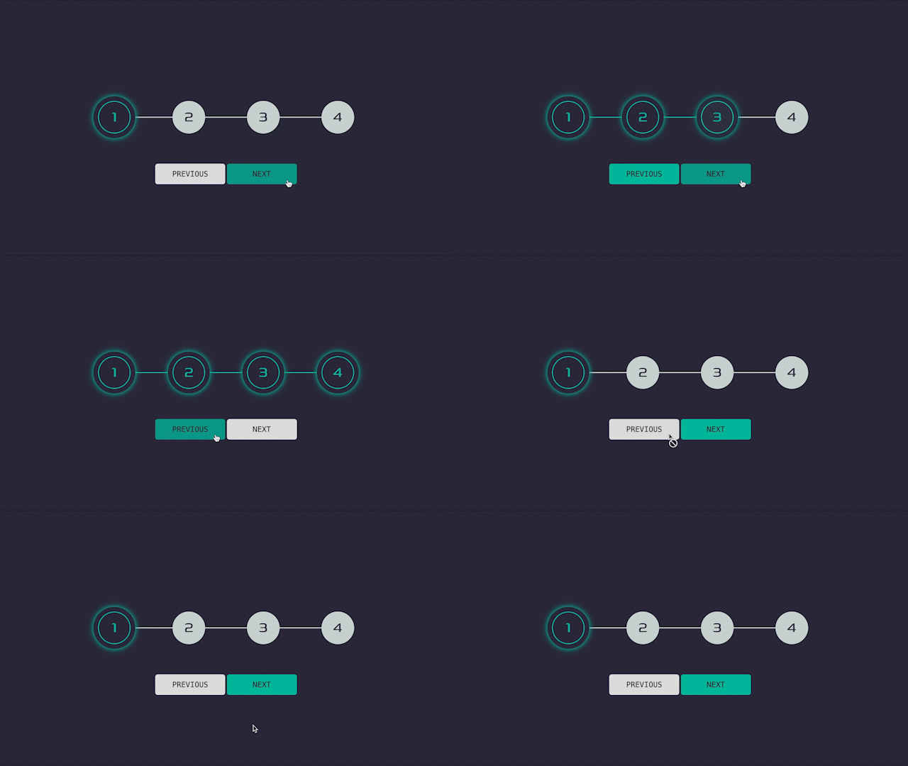
Have you ever wanted to build a fully custom steps progress bar? Well, this is the article you’ve been looking for.

Ever since I started coding, I’ve always been a fan of building my own stuff especially when it involved something cool, like this steps progress bar. This is just the simplest version of it. Once you learn how to build the skeleton, you can then add a form to it or some other steps that a potential user needs to interact with.
A couple of things to consider, before we get into coding:
- I build the project in mobile-first workflow
- I’m using SCSS instead of plain CSS, but if you’re not familiar with it, you can use this awesome SCSS to CSS converter
- I’m using BEM notation for the class names
- The project in its different stages and final result will be available on codesandbox.io
Alright, now that’s out of the way, we can get into the fun part. Let’s write some code, shall we?👨🏻💻
1. Adding Initial Setup
For the initial setup, I just added some basic HTML and CSS, which will add most of the content, variables and some resets.
In CSS resets, I also added this line in html:
font-size: 62.5%; // 100% / 16px = 62.5%Since I’m using rem for my font sizes and other stuff, it becomes pretty hard to convert rem to px in mind. So, this is a trick that helps to calculate rems easier. For example, with this setup, 16px is equal to 1.6rem and 100px is equal to 10rem. However, we still need to bring the default font size back to 16px for accessibility reasons, so I also add this line in body:
font-size: 1.6rem;And in case if you’re not familiar with SCSS, this is how you initiate variables in SCSS $name: value;.

