How I Share React Components Between Projects
Cut development time by sharing components with Bit!

As a developer, I’m always building new apps and I often find myself repeating a lot of tasks. Every application I build consists of forms, buttons, navigation bars, cards, and many more components that are often similar across each app. And re-building these components every time is highly inefficient and unproductive.
One approach I’ve taken is to package each component as its separate NPM module and install it onto my projects.
Though this works, I have to update the versions of all places manually. I also have to take care of dependency management. For example, if a component of mine uses MUI, NPM cannot automatically understand this.
But I recently started using a tool — Bit which addresses these concerns and offers a lot more! With its component-driven architecture, Bit streamlines the development of composable applications.
Bit lets me share and reuse independent components effectively while designing, developing, testing, and versioning them in isolation. By letting me reuse components across my projects, Bit rapidly improves my development time.
👉 Find out how Bit’s component-driven approach improves development efficiency:
Using Bit to Share Components
Step 01 — Installing Bit
Before moving forward, you’ll need to install the Bit CLI using the command:
npx @teambit/bvm installNext, you’ll need to verify that the CLI has been installed successfully by running the command:
bit --versionIf you’ve installed Bit correctly, you should see the screenshot below.

Next, you’ll need a Bit account to share your components. Therefore, create an account with this link.
Step 02 — Creating a Scope on Bit
Next, you’ll need to create a remote scope on Bit.
💡 A scope is a remote collaboration server that will host your components. Once you’re ready, you can ship your components off to this scope so that others can use your components or contribute to it.
Head over to this link to create your first scope on Bit. Fill in the required information, as shown below, and click “Create Scope” to create it.

Next, you’re ready to start building your first Bit component!
Step 03 — Setting up the development environment
To build a Bit component, you’ll need to create a workspace. A Bit workspace is a temporary, disposable tool that you can use to design, develop, test, and version your Bit components in an independent manner.
To keep things simple for this article, let’s set up a workspace that we can use to build React components. So, open a new terminal and execute this command:
bit new react my-workspace --env teambit.react/react-env --default-scope my-org.my-scopeBe sure to replace my-org.my-scope with your Bit username and scope name (the name you set in Step 02). In my case, I'll use lakindu2002.component-sharing.
Next, run bit start to launch the development server. Head over to localhost:3000 to view your development server.
If you’ve done everything correctly, you should see the output below.

Step 04 — Building your first shareable component
Next, you’ll need to create a component that you’ll want to share across your projects. For this article, let’s make a simple Button component that has three variants — text, outlined and contained.
To do so, you’ll first need to create a component. Run the command shown below to create your component:
bit create react design/buttonLet me explain what’s happening here:
react: This is the template we use to create our component. You can runbit templatesto gain an idea of the different types of components you can createdesign: This is the namespace that our component will be stored in. A namespace is a group that's present within a scope that's used to group your components.button: This is the name of the component.
Once you run this command, you’ll see the folder structure shown below:
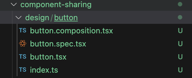
Out of the box, you’ll see four files created for you.
button.composition.tsx: This is the file you'll use to define all the different ways your component can be used.button.spec.tsx: This is the file you'll use to define the test cases for your component.button.tsx: This is the file you'll use to define the actual Button.index.tsx: This is the file you'll use to expose the API consumers can use.
First things first, let’s first define the button. Open the button.tsx file and add the code shown below:
import type { ReactNode } from 'react';type ButtonVariant = 'contained' | 'outlined' | 'text';export type ButtonProps = {
label?: string;
onClick?: () => void;
variant?: ButtonVariant;
};export function Button({
label = 'Hello World',
onClick,
variant = 'text',
}: ButtonProps) {
return (
<><buttononClick={onClick}style={{
padding: '8px 16px',
fontSize: '14px',
borderRadius: '4px',
cursor: 'pointer',
...(variant === 'contained' && {
backgroundColor: '#007bff',
color: '#fff',
border: 'none',
}),
...(variant === 'text' && {
backgroundColor: 'transparent',
color: '#007bff',
border: 'none',
}),
...(variant === 'outlined' && {
backgroundColor: 'transparent',
color: '#007bff',
border: '1px solid #007bff',
}),
}}
>
{label}
</button></>
);
}
We’ve implemented a simple Button that switches CSS based on the provided variant.
Next, let’s define some variations of our component by adding the following code to the button.compositions.tsx file.
import { Button } from './button';export const ContainedButton = () => {
return (
<Button
label="Hello World"
variant="contained"
onClick={() => alert('Clicked')}
/>
);
};export const TextButton = () => {
return (
<Button
label="Hello World"
variant="text"
onClick={() => alert('Clicked')}
/>
);
};export const OutlinedButton = () => {
return (
<Button
label="Hello World"
variant="outlined"
onClick={() => alert('Clicked')}
/>
);
};
Over here, we use the created component and defined its possible usage.
Next, save your component and visit your development server to see your Button component in action!

As seen above, Bit offers a clean-looking “Overview” panel that lets us glance into the defined compositions and the prop definitions! This means that anyone using this component through Bit will gain explicit knowledge on how to use it.
Step 04 — Sharing your first component
Now that we’ve built the component, we can share it with the world! To do so, you’ll need to create a new component version and export it to the scope you created earlier.
Therefore, run the command below:
bit tag && bit exportThe command above will automatically create a version for your Button component using Semantic Versioning and export it to Bit Cloud.
You will see the output below if your component has been shared properly.
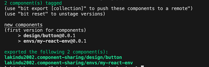
Figure: Tagging and exporting the components
Finally, you can head over to your remote scope to view your component live for the world to see!
Here’s a link to the Button component that I developed.

Step 05 — Using your component in different projects
There are several ways that you can use a Bit component.
- As a packaged module
- As an imported module
- Within Bit
Let’s look at each approach carefully.
Using Bit Components as Packaged Modules
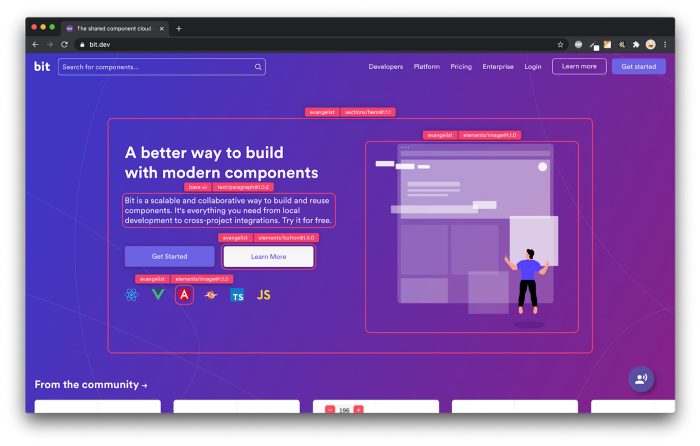
The first way is using your component as a packaged library which can be installed using NPM, Yarn, or PNPM. To do so, head over to Bit.cloud and search for the Button component you’d like to use.

As shown above, Bit automatically shows you your components + the components that others have built. In this case, I’ll install the component I made.
When you open any Bit component, you’ll see a “Use” button on the top right. This is where you’ll have to go to use your component.

To install this component as an NPM module, run the following code in your React project:
npm config set '@lakindu2002:registry' https://node.bit.cloud
npm i @lakindu2002/component-sharing.design.button
Afterwards, you can import the component as you’d normally use a module:
import React from 'react';
import { Button } from '@lakindu2002.scoping-components/design/Button';
const App = () => {
const handleClick = () => {
console.log('Button clicked!');
}; return (
<div><Button variant="contained" label="Contained Button" onClick={handleClick} /><Button variant="text" label="Text Button" onClick={handleClick} /><Button variant="outlined" label="Outlined Button" onClick={handleClick} /></div>
);
};export default App;
Using Bit Components as Imported Modules
You might wonder — what if I have to change this component before using it?
If you’re using it as a packaged module, you must ask the author to publish a version with your requested changes. But when you import a component, you’re able to make changes to it, and consume it!
Run the command below in a Bit workspace to import your component:
bit import lakindu2002.component-sharing/design/buttonThis will create a new component in your Bit workspace. Next, you can update its code and consume it like you would for a standard Bit component.
Using Bit Components within Bit
Finally, this is where things get interesting. Bit recently introduced the App component that lets you build composable React apps with independent components within Bit. You no longer have to rely on npx to maintain a React app. You can develop your application, version it independently, and ship it off to a Bit scope along with the rest of your components.
The beauty of this is that Bit automatically takes care of your dependency management. So, if you change your Button component while it’s being used in the App, Bit will create a new version for your App automatically to ensure that it’s using the latest version of your Button!
So, create an App with Bit using the command:
bit create react-app apps/my-app --aspect teambit.react/react-envThis will create the output directory shown below:

This is exactly like a traditional React app. You have your my-app.tsx that lets you build your React app. Next, you have your root file that takes care of initializing the React DOM, and finally, you have a CommonJS file that lets you define deployment configurations to integrate CI/CD.
Open the my-app.tsx and add the code below to start using our Button!
import { Button } from '@lakindu2002/component-sharing.design.button';export function MyApp() {
return (
<Button
label="Hello, from App!"
onClick={() => alert('Launched from App')}
variant="text"
/>
);
}Next, run the command below to launch your app as a React app:
bit use apps/my-app && bit run my-appFinally, you should see the output shown below:

Wrapping Up
And voila! Component sharing has never been easier, all thanks to Bit. With Bit, you can swiftly design, develop, build, test, and version your components independently while ensuring high shareability and reusability.
We can now decide to incrementally add to this as we go along our programming journey. We can even invite other devs to contribute to our code, just like we would with any other project.
💡 What’s more, you can even integrate Bit into your existing projects. If you have a legacy application that needs to be modernized, you could consider using Bit to easily break down your monolithic codebase into independent components that are easy to update and maintain.
Learn more:
It also doesn’t stop there because thousands of other component libraries are sitting and waiting on Bit for you to explore!
If you want to contribute, feel free to access my scope to use the components we built in this demo.
Thank you for reading.
👉 Also, check out this video on reusing and sharing React components across applications:
Build composable React apps with reusable components, just like Lego
Bit is an open-source toolchain for the development of composable software.
With Bit, you can develop any piece of software — a modern web app, a UI component, a backend service or a CLI script — as an independent, reusable and composable unit of software. Share any component across your applications to make it easier to collaborate and faster to build.
Join the 100,000+ developers building composable software together.
Get started with these tutorials:


